Kern
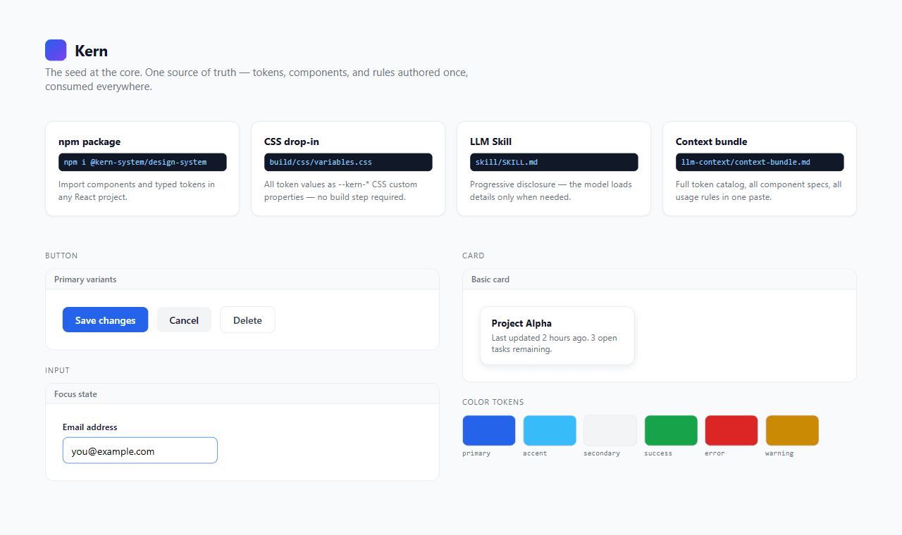
One set of design tokens, four ways out: npm, plain CSS, a Tailwind preset, and a bundle an LLM can read.
Why I built it
Every project I start ends up with its own scattered pile of colors, spacing values, and button styles, redefined slightly differently each time. Kern is an attempt to author that pile exactly once — as W3C DTCG tokens — and let one build step produce everything downstream: CSS custom properties, a Tailwind preset, typed TypeScript exports, and a matching React component library.
Four ways out, one source
The same 116 tokens ship as an npm package for React projects, a plain variables.css drop-in for projects that don't want a build step, and a Tailwind preset for anything already on that system. Change a token once, run the build, and all three update together — no manual syncing between them.
The fourth output is for a model, not a person
The same build step also generates an LLM skill bundle and a single context-bundle file — the full token catalog and component specs in one paste. The idea is that when an AI tool is writing UI code against this system, it should be working from the same source of truth I am, not guessing at hex values from a screenshot.
Where it actually is
Three components — Button, Card, Input — each with a full spec: props, states, accessibility notes, do/don't usage rules. It was built in a single session, which shows in the component count more than in the pipeline: the token-to-four-outputs architecture is the part I'm confident in, and it scales to more components without changing.
What I'd tell someone building this
Get the pipeline right before the component count. It's tempting to measure a design system by how many components it has, but three components on a build step that regenerates four correct outputs is worth more than twenty components with values hand-typed in four different places.